Whenever a company, factory, or even country decides to produce something, there is only so much they can make. A finite amount of capital (factories, production equipment, etc) and laborers exist, and they limit the possible amount of production. The production-possibility frontier, or PPF, is a graphical way of showing trade-offs in production choices between 2 items.
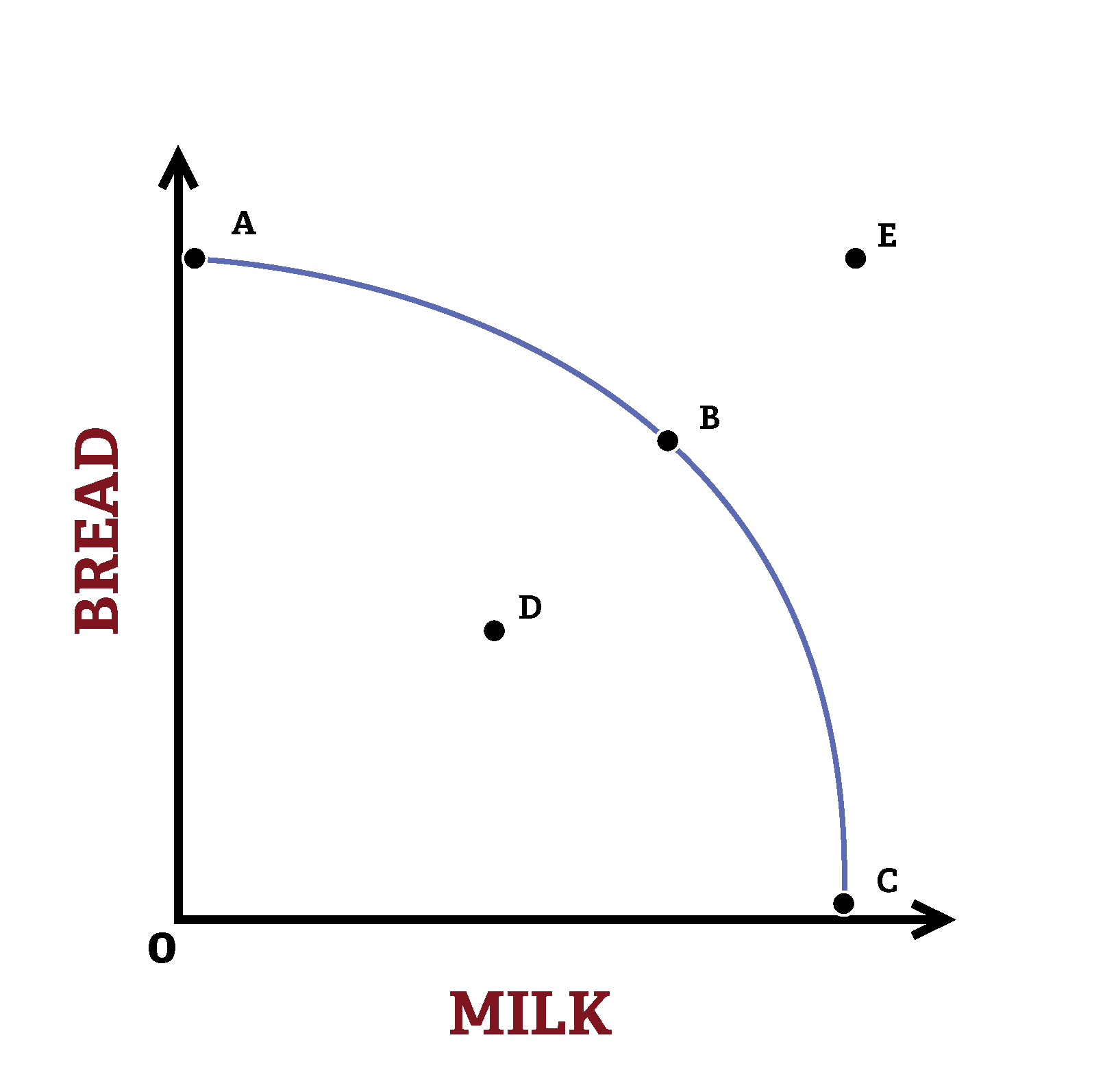
If the United States decided tomorrow to produce as many loaves of bread as possible, there would be a limit to how many loaves were made. Only a certain amount of ovens, flour, and people exist at the present time. Say that it is decided we will produce milk as well. Only a certain amount of workers exist in the labor force, and with half making milk and half making bread, we can only produce a finite amount. A PPF would represent how much of either item we can produce:

In this way, a PPF represents the trade-offs that are inherent to production. The PPF assumes that labor supply, production facilities, and more are all fixed numbers. In this sense the PPF shows short term production possibilities. While production can always be increased, it takes a long time to build new factories, find new workers, and more. So, the PPF shows what the current-state of production would look like.
Imagining a PPF for a whole country can be hard, because it seems awfully simplistic. PPFs can be useful for companies or even individual factories - they provide a nice way of looking at all the options one has for production.
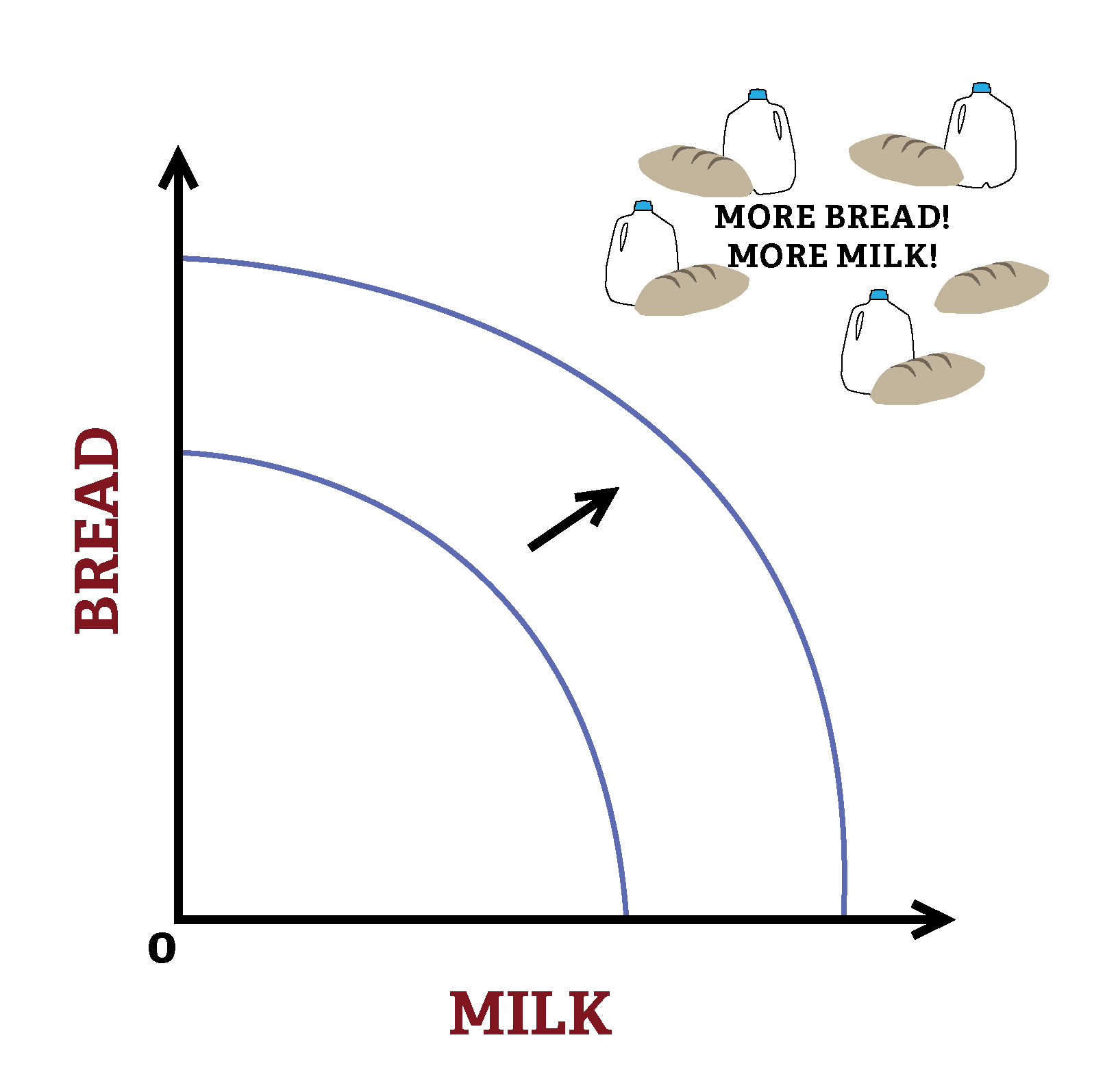
A PPF can also indicate if production is efficient, as the line of the PPF consists of all the possible efficient production points (i.e., all possible resources are being used and utilized, production is maxed out). Look below at point B - America is using all the possible resources to make as much bread and milk as possible. Point A and C are efficient, too, as all the resources in the economy are being used to produce bread or milk. In fact, any point along the PPF line will be efficient! However, point D is inefficient, as America could be making more bread and milk. Point E would be a great goal, but is impossible to reach with existing resources. That doesn't mean we can reach point E one day, though. If the economy grows through changes like new technology, better management and additional workers the PPF shifts outward, and we are now able to make more things!
PPFs are not all curved outward, either! The shape can change depending on characteristics of the economy it represents. A linear PPF indicates that the goods can be interchangeably produced. For example, a factory equipped with ovens and other baking equipment could easily shift between making bread one minute and cookies the next! They don't have to buy separate equipment for these processes or hire different workers. A factory could not shift between making bread and making milk that easily, so it will be a bigger trade-off for them. Changing from producing all bread to half bread and half milk would cost them a lot more than changing to half bread and half cookies.
A PPF curved inward indicates "economies of scale". This means that the more of a good that is produced, the less it costs to produce each additional unit. This would apply for something like bulk production, where producing 1 unit will cost a minimum of $1000 to pay for workers and equipment, producing 2 would cost $1010, 3 would cost $1020, and so on. In this way, as more is produced the cost of each unit declines. Eventually, the decline in individual cost will become less dramatic and flatten out.
In Short:
The PPF is a graph that can show trade-offs in production. It is a very flexible framework that can be applied to various industries and economic areas, and provides a visual way to represent production choices. PPFs can be used to represent a wide variety of economic concepts, including opportunity cost (trade-offs), efficiency in production, efficiency in allocation, economies of scale (diminishing costs of production), and resource scarcity.


Money represents a social agreement, which has implications for how we value wealthy people. Bitcoin replaces the need for this social agreement with technology, and in doing so challenges the values we ascribe to wealth.